
Moodle’s Configurable Reports block is great for pulling precise data via SQL queries, and it includes a basic chart preview. The Configurable Reports Chart block (block_cr_charts) builds on this by turning a saved report into a chart that can be displayed directly on a course page or dashboard, not just inside the report itself.
Key Features
Once a SQL report exists in Configurable Reports, this block reads its output and renders it as a chart. Configuration covers:
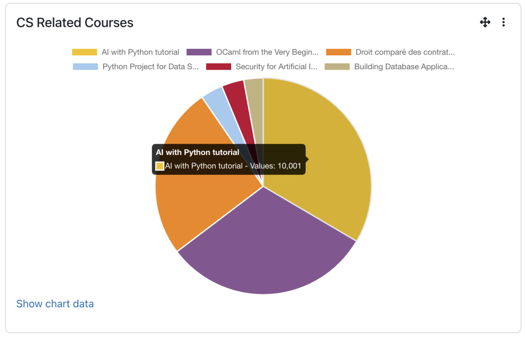
| Chart Type | Choose how the data is visualised, with options including bar charts, pie charts, line graphs, and doughnut charts |
| Chart Title | Set a custom heading shown above the chart |
| Axis Labels | Map the report’s columns to the x-axis and y-axis so the right data is plotted |
| Date Range | Set a default time period for the data shown, such as all time or the last 30 days |
| Colour Scheme | Pick the colour theme used to render the chart |
| Display Region Settings | Control where the block appears on the page |
The chart updates automatically whenever the underlying report runs.
Who it Helps
- Administrators
Get a quick visual summary of site-wide data, such as enrollments across courses, without opening a spreadsheet. - Teachers and Trainers
Track engagement and popularity trends for each course at a glance. - Course Creators
Use charts during reviews or meetings to support data-driven discussions. - Students
Benefit indirectly when teachers use these charts to identify courses or activities that may require additional support.
The Problem it Solves
Reports often require users to click through one or more pages before they can view the data visualisations. Configurable Reports Chart removes this extra step by displaying charts directly on a course page or dashboard, making key insights immediately visible as soon as the page loads. Teachers and administrators no longer need to locate and open individual reports to access important data.
Practical Benefits for Moodle Users
Setting it up feels familiar from the start. Placing the block on a dashboard, course page, or any other Moodle display region is quick and straightforward, allowing administrators to position the chart wherever it will be most visible and useful. While creating or configuring the report may still require technical knowledge, especially for users working with SQL-based reports, displaying the chart itself is simple.
In addition, the chart can be displayed alongside other Moodle blocks already in use, such as Calendar, Activity, or Recent Activity blocks, building a full picture of a course or site at a glance, all within Moodle itself.
Simple Tutorial
- Open the block drawer (square icon, top right) → + Add a block → select Configurable reports chart.
- Click the block’s ⋮ menu → Configure.
- Set: SQL report, Chart type, X-axis and Y-axis column aliases (must match your SQL query’s column names exactly).
- Save changes.
If you would like to explore how the Configurable Reports Chart block can enhance reporting within your Moodle™ environment, our team at Pukunui is here to help. Contact us to discuss implementation options and discover how visual reporting can support more informed decision-making across your organisation.